– Where Does the Real Problem Reside? Two Charts Showing the 0.01% vs. the 1% (Liberty Blitzkrieg, March 31, 2014):
While I always supported the overall message and energy that encompassed the Occupy Wall Street movement, I never backed the slogan of the 1% vs. the 99%. From my own personal experience, it is entirely clear that the actual problem is a far smaller group within the 1%, the 0.1% or the 0.01% (although I recognize “We Are the 99.9%” isn’t catchy).
This is why you’ll never hear me demonize “the 1%”, rather I always try to use the term oligarch, which refers a small handful of people who benefit most disproportionately from Federal Reserve handouts, D.C. corruption, tax code loopholes and the destructive trend of financialization generally.
This is is also why I became so disgusted by Sam Zell’s ignorant and destructive comments on Bloomberg television earlier this year that decided to pen an open letter to him.
Thanks to The Atlantic, we now have two charts that show what I have been writing about for many years now. It is not the 1% that is the problem, it’s actually a much smaller slice within that group that is thieving and pillaging at will from the rest of American society.
From The Atlantic:
I’ve written, over and over, that the most important divide in our wealth disparity was between the 1 percent and the 99 percent. For example, when I compared the evolution in investment income since the late 1970s, I often imagined a graph like this from the Economic Policy Institute, showing the 1 percent flying away from the rest of the country.
It turns out that that graph is somewhat misleading. It makes it look like the 1 percent is a group of similar households accelerating from the rest of the economy, holding hands, in unison. Nothing could be further from the truth.
A few weeks ago, I shared this graph (from the World Top Incomes Database) showing how the top 0.01 percent—that’s the one percent of the 1 percent—was leaving the rest of the top percentile behind.
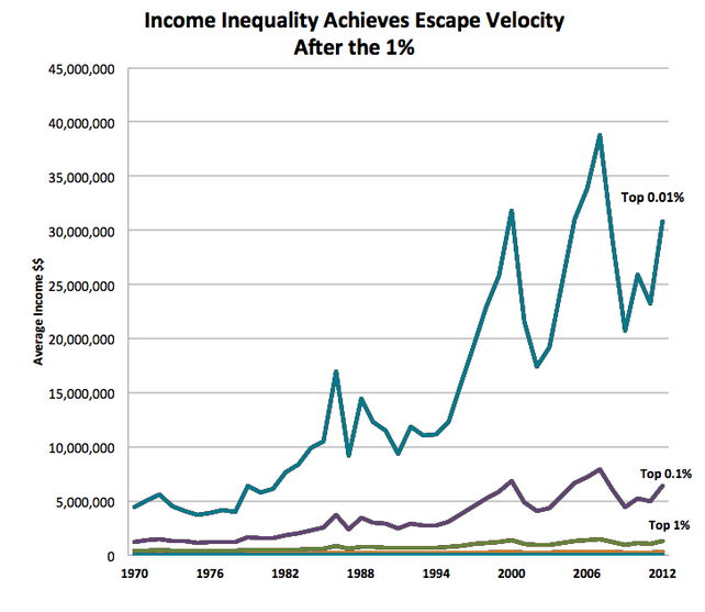
It’s even more egregious than that. An amazing chart from economist Amir Sufi, based on the work of Emmanuel Saez and Gabriel Zucman, shows that when you look inside the 1 percent, you see clearly that most of them aren’t growing their share of wealth at all. In fact, the gain in wealth share is all about the top 0.1 percent of the country. While nine-tenths of the top percentile hasn’t seen much change at all since 1960, the 0.01 percent has essentially quadrupled its share of the country’s wealth in half a century.
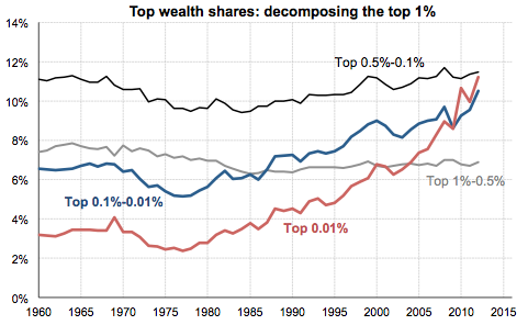
It turns out that wealth inequality isn’t about the 1 percent v. the 99 percent at all. It’s about the 0.1 percent v. the 99.9 percent (or, really, the 0.01 percent vs. the 99.99 percent, if you like). Long-story-short is that this group, comprised mostly of bankers and CEOs, is riding the stock market to pick up extraordinary investment income. And it’s this investment income, rather than ordinary earned income, that’s creating this extraordinary wealth gap.
The mainstream is finally starting to figure it out. From crony capitalistic corporate welfare (even the New York Times covered oligarch welfare last week) to the 0.01% problem. Now if the nine tenths of the 1% would stop complacently continue to tread water and challenge the oligarchs we might actually be able to change things.
Full article here.
In Liberty,
Michael Krieger