– WTF Chart Of The Day: Spanish “Recovery” Edition (ZeroHedge, Feb 5, 2014):
The following chart of Spain’s housing market really speaks for itself, and certainly conflicts with Rajoy’s promises that not only is the recession in the country over but it is recovering.
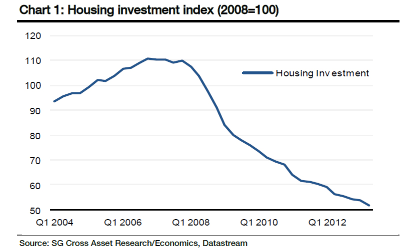
And for those unconvinced, here are some additional thoughts from SocGen:
Since the housing bubble burst in late 2007, housing prices in Spain have fallen by almost 40%. Six years later, the debate is about whether the bottom has been reached. Our view is that there is still room for a correction in 2014, despite the encouraging macro economic conditions. Pressure on prices will continue due to the current level of household income, household debt servicing and the oversupply of housing stock. We foresee equilibrium reached at an additional 10% to 15% drop in housing prices. Despite the ease in financial markets, we do not expect household access to funding to improve massively. We therefore expect construction to be a drag on growth in 2014 as the sector is far from recovering.
Demand for dwellings in Spain is frozen
The supply/demand gap in the housing market has been widening for the last five years. Considering the current level of real wages and the high level of unemployment, household income is not expected to see any significant growth. Combined with current house prices, the aforementioned conditions should translate into low demand in the housing market. In addition, hikes in home purchase taxes began in 2013 and will not end until 2015 at best. The Spanish housing rental market suffers from a lack of experience and represents less than 8% of total stock, despite the government’s efforts to boost it, so there is no real potential for absorbing excess stock in housing.
Quest for a fair price: prices likely to drop further
A normalisation process still has to take place in the housing market before prices stabilise. Demand is mild at the moment; however, bids are lower than asking prices.A report prepared by one of the major real estate portals in Spain (idealista.com) notes that of a sample of 0.5m bids since 2010, the prices offered were 24% lower than the bids (as of August 2013). As anecdotal as this might sound, the key message behind the statistic is that Spanish households are indeed waiting for a correction in prices.

Household solvency has been negatively impacted by the worsening labour market in recent years. We also note deterioration in household housing wealth due to falling house prices.
Looking at the price to income ratio in chart 5, we see that Spanish prices must fall 12.6% to return to their long-term average, which coupled with the oversupply in stock, points to further corrections. The price to rent ratio is also a harbinger of the same overvaluation vs the longterm average of 20%. We believe that the same scenario has been happening in Ireland, which compared to Spain, has a more severe ongoing price correction.
Average household income no longer reflects a household’s ability to acquire a house at current prices. Our baseline scenario for Spain assumes little to no growth in real wages this year, further undermining the ability of households to access funding.

Demand is not expected to increase massively for the current year, as real wages are not expected to grow – despite the positive economic outlook. The debt burden on households is around 15% due to income contraction, which is high compared to other countries that have lived through a housing crisis.
All in all, should the economic recovery in Spain follow its current trend, our estimates indicate that housing prices should fall by another 10% to 15% before they stabilise. The IMF’s latest report on Spain indicated 15% overvaluation, in line with our estimate. Evidently, if the market were to endure any further shock, this time frame for correction would expand. Recovery in the housing sector in Spain hinges on an improvement in employment and access to credit, both of which are prey to uncertainty.
Charts are an amazing device, very easy to read and understand. I used to tutor foreign students in economics by using them……one chart can convey much information.
This chart says it all. It is in the tank.