– You’ve Seen It Before, And Here It Is Again: “The Chart That Tears Apart The Stimulus Package”(ZeroHedge, July 7, 2012):
Over a year ago we penned “QE 2 Was A Disaster: Here Is Why US Fiscal “Stimulus” Was A Complete Failure As Well“, because, well, QE2 was a disaster, which is important to remember as we are about to set off on the NEW QE as per Hilsenrath, because apparently creating 80,000 jobs per month (with the S&P a whopping 5% off multi-year highs) “Leaves Door For Fed Wide Open” even though the Fed has shown beyond a shadow of a doubt it is incapable of creating jobs and at best can ramp the Russell 2000 for a few months. But more importantly, a year later it is obvious that the ARRA just kept on being wronger and wronger with each passing month, until we get to today. We will spare readers our conclusion about ARRA architect Christina Romer’s (long gone from the administration for obvious reasons) predictive powers, suffice it to say they are on par with those of the Fed itself. Simon Black, using AEI data, reminds us how the ARRA chart looks, one year later.
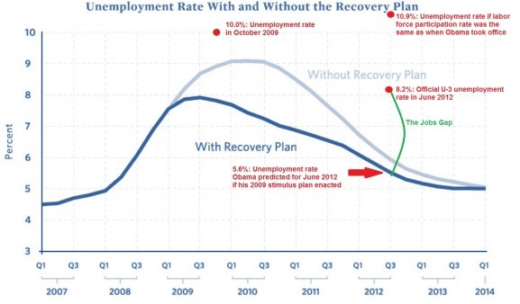
The graph that tears appart the stimulus package
After Obama was elected, one of his first initiatives was to enact a massive stimulus package in order to reduce the rising unemployment after the housing collapse and bailout all the failing banks. When promoting his plan, the President offered many promises about the success of his idea but very few have so far come to fruition. Below is a graph that was supposed to estimate the effects of the stimulus, however as you can see, it far from achieved the President’s goals.
AEI reports on the ineffectiveness of the program:
This was not the employment report either the American worker or the Obama campaign wanted to see right now. The Labor Department said the U.S. economy created just 80,000 jobs in June, less than the 90,000 economists had been forecasting. And private-sector job growth was just 84,000, down sharply from 105,000 in May. Not doing fine.
The unemployment rate stayed at a lofty 8.2%.
This continues to be the longest streak — 41 months — of unemployment of 8% or higher since the Great Depression. And recall that back in 2009, Team Obama predicted that if Congress passed its $800 billion stimulus plan, the unemployment rate would be around 5.6% today.
– If the size of the U.S. labor force as a share of the total population was the same as it was when Barack Obama took office—65.7% then vs. 63.8% today—the U-3 unemployment rate would be 10.9%. Even if you take into account that the LFP should be declining as America ages,theunemployment rate would be 10.5%.
– The broader U-6 unemployment rate, which includes “all persons marginally attached to the labor force, plus total employed part time for economic reasons,” is 14.9%, up a bit from May.
– The average duration of unemployment ticked up to 39.9 weeks.
